Chrome is trialing two APIs, the Device Posture API and the Viewport Segments Enumeration API, which are available as an origin trial from Chrome 125. These are known collectively as the Foldable APIs, designed to help developers target foldable devices. This post introduces these APIs, and provides information about how to start testing them.
There are mainly two different physical form factors: devices with a single flexible screen (seamless), and devices with two screens (with seam, also known as dual screen devices).
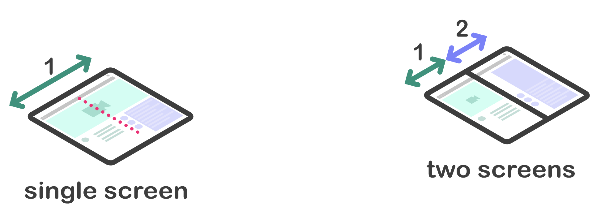
These devices present challenges and opportunities to developers. They provide additional ways in which content can be viewed. For example, a user might hold a seamless device like a book and then change to using it like a tablet with a flat screen. Devices with two screens have a physical join between the screens that may need to be accounted for.
These new APIs provide ways for developers to provide better user experiences for these devices. Each API exposes the needed web platform primitives in two ways, through CSS and JavaScript.
Device Posture API
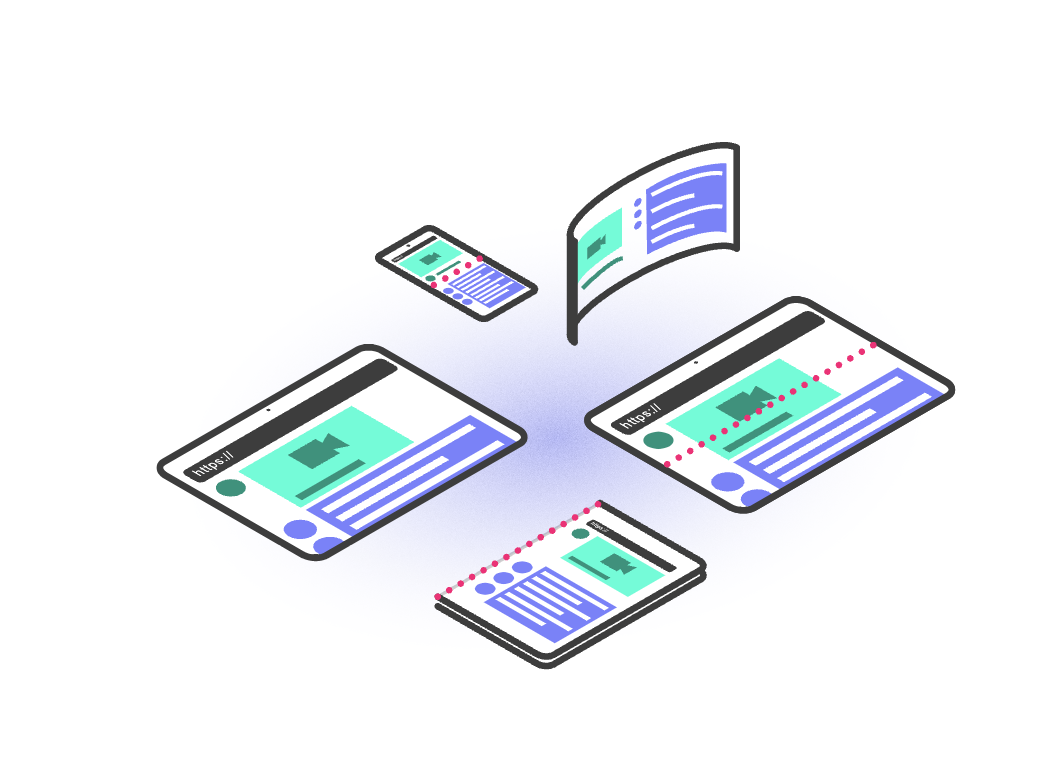
Foldable devices have capabilities that allow them to change their_ posture_, or the physical state of the device. They can change their form factor allowing content authors to provide a different user experience, and these new APIs make sure web content can react to the various folding states.
There are two device postures a device can be in:
folded: Laptop or book postures.

continuous: Flat, tablet, or even seamless curved displays.
CSS
The Device Posture API specification defines a new CSS media-feature—device-posture. This media feature resolves to a set of fixed postures. These postures consist of a number of predefined values that each encompass a physical state of the device.
The values of the device-posture feature match the previous description of
possible postures:
foldedcontinuous
New postures could be added in future if new devices come to the market.
Examples:
/* Using the device in a 'book' posture. */
@media (device-posture: folded) { ... }

/* Using the device in a 'flat' posture, or any typical device like a laptop or
desktop device. */
@media (device-posture: continuous) { ... }
JavaScript
To query a device's posture, a new DevicePosture object is available.
const { type } = navigator.devicePosture;
console.log(`The current device is of type ${type}.`);
To react to device posture changes, such as a user fully opening a device and
therefore moving from folded to continuous, subscribe to change events.
navigator.devicePosture.addEventListener('change', (e) => {
  console.log(`The device posture changed to type ${e.type}`);
});
Viewport Segments API
The viewport segments are CSS environment variables that define the position and dimensions of a logically separate region of the viewport. Viewport segments are created when the viewport is split by one or more hardware features (such as a fold or a hinge between separate displays) that act as a divider. Segments are the regions of the viewport that can be treated as logically distinct by the author.
CSS
The number of logical divisions are exposed through two new media features,
defined in the CSS Media Queries Level 5 specification:
vertical-viewport-segments and horizontal-viewport-segments. They resolve to
the number of segments the viewport is broken into.
In addition new environment variables have been added to query the dimensions of each logical division. These variables are:
env(viewport-segment-width x y)env(viewport-segment-height x y)env(viewport-segment-top x y)env(viewport-segment-left x y)env(viewport-segment-bottom x y)env(viewport-segment-right x y)
Each variable has two dimensions, which represent the x and y position, respectively, in the two-dimensional grid created by the hardware features separating the segments.
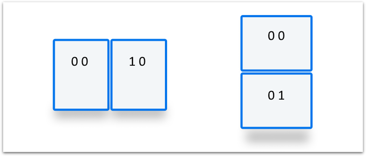
The following code snippet is a simplified example of creating a split UX where we have two content sections (col1 and col2) on each side of the fold.
<style>
  /* Segments are laid out horizontally. */
  @media (horizontal-viewport-segments: 2) {
    #segment-css-container {
      flex-direction: row;
    }

    #col1 {
      display: flex;
      flex: 0 0 env(viewport-segment-right 0 0);
      background-color: steelblue;
    }

    #fold {
      width: calc(env(viewport-segment-left 1 0) - env(viewport-segment-right 0 0));
      background-color: black;
      height: 100%;
    }

    #col2 {
      display: flex;
      background-color: green;
    }
  }

  /* Segments are laid out vertically. */
  @media (vertical-viewport-segments: 2) {
    #segment-css-container {
      flex-direction: column;
    }

    #col1 {
      display: flex;
      flex: 0 0 env(viewport-segment-bottom 0 0);
      background-color: pink;
    }

    #fold {
      width: 100%;
      height: calc(env(viewport-segment-top 0 1) - env(viewport-segment-bottom 0 0));
      background-color: black;
    }

    #col2 {
      display: flex;
     background-color: seagreen;
    }
  }
</style>

<div id="segment-css-container">
   <div id="col1"></div>
   <div id="fold"></div>
   <div id="col2"></div>
 </div>
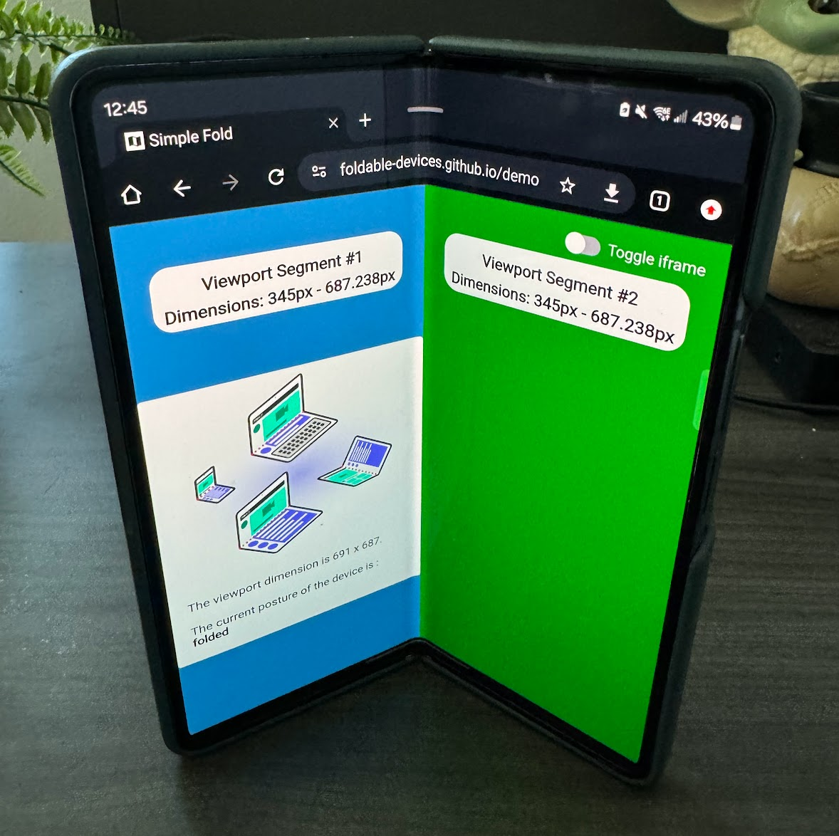
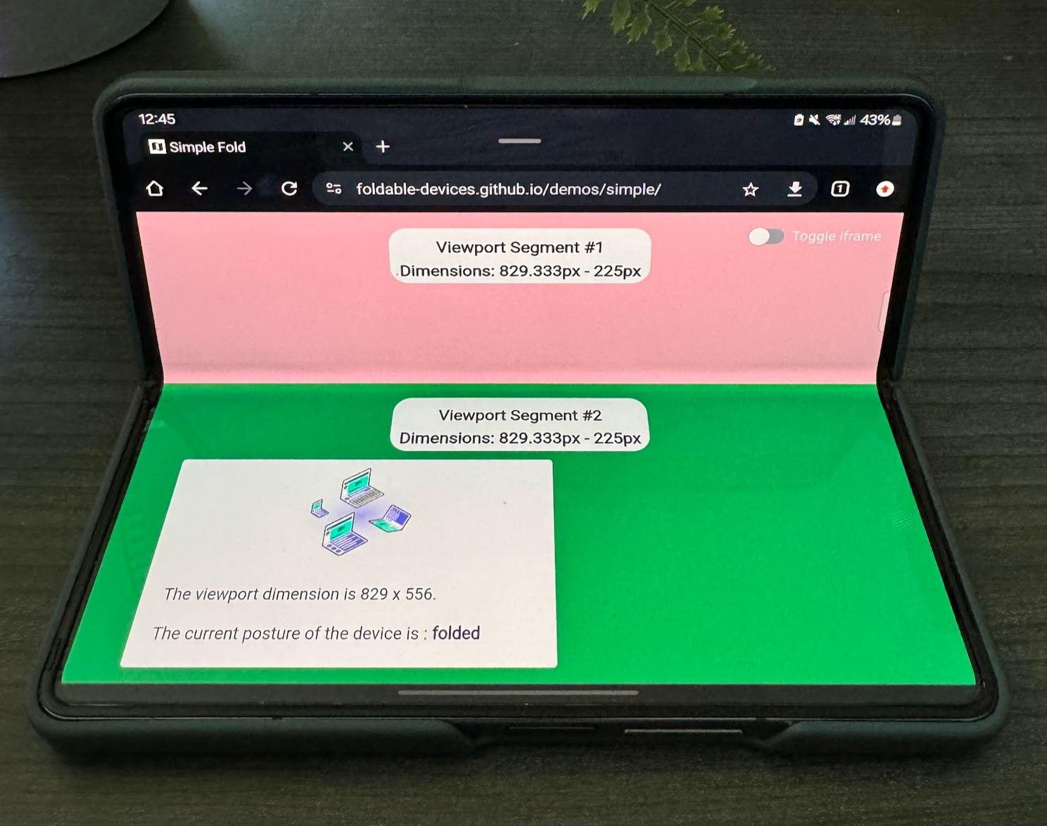
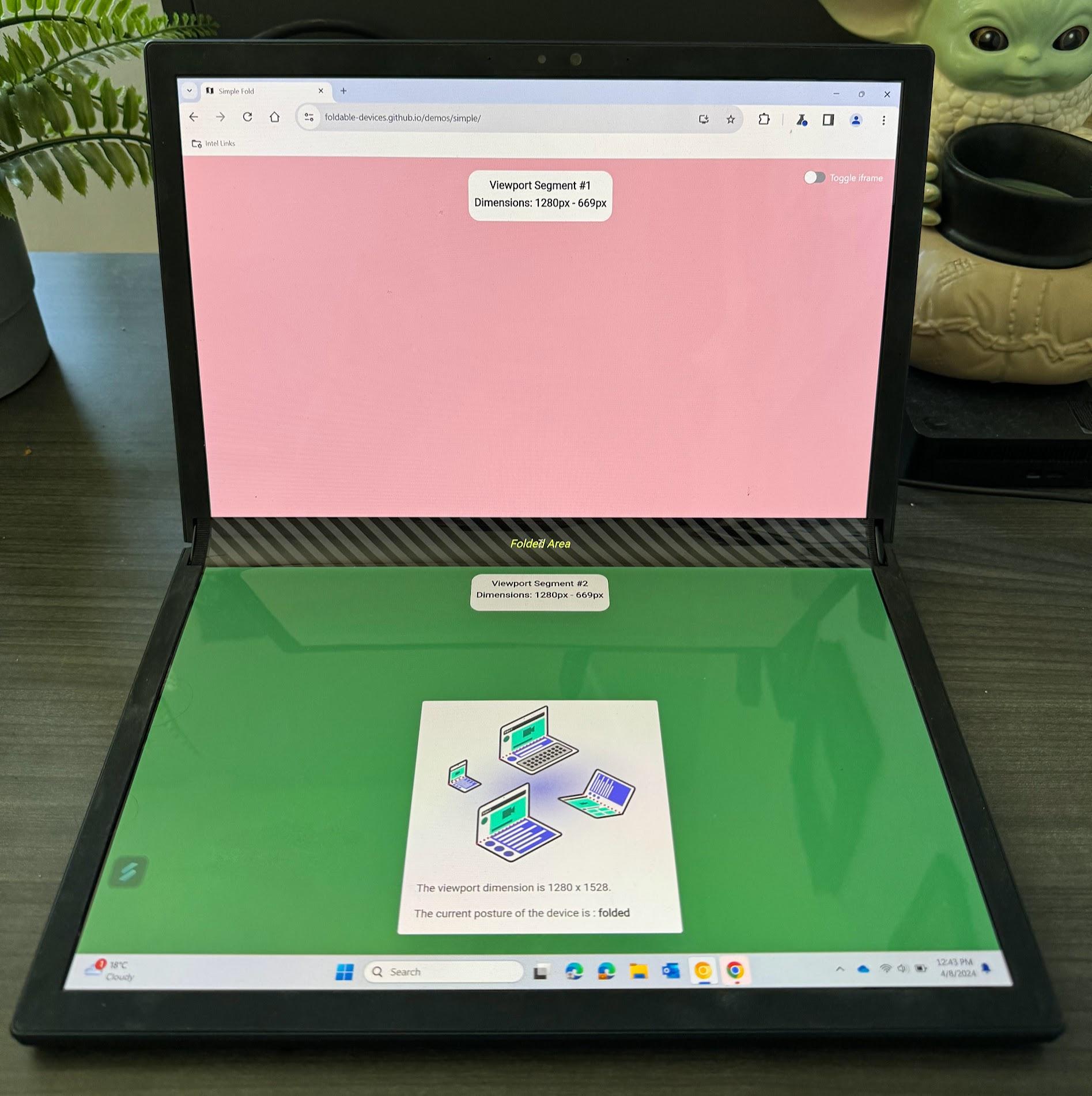
The following photos show what the experience looks like on a physical device.
JavaScript
To get the number of viewport segments, check the segments entry in the
visualViewport.
const segments = window.visualViewport.segments;
console.log('The viewport has the following segments:', segments);
Each entry in the segments array represents each logical segment of the
viewport with a DOMArray describing the coordinates and size. The segments
field is a snapshot of the given state when queried, in order to receive updated
values you need to listen to posture changes or resize events and requery the
segments property.
Try the Foldable APIs
The Foldable APIs are available in an origin trial from Chrome 125 through Chrome 128. See Get started with origin trials for background information on origin trials.
For local testing, the Foldable APIs can be enabled with the Experimental Web
Platform features flag at
chrome://flags/#enable-experimental-web-platform-features. It can also be
enabled by running Chrome from the command line with
--enable-experimental-web-platform-features.
Demos
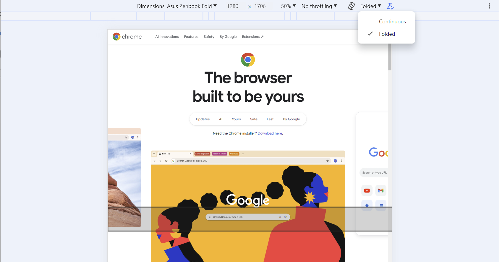
For demos, see the demos repository. If you don't have a physical device to test with, you can choose the Galaxy Z Fold 5 or Asus Zenbook Fold emulated device in Chrome DevTools and flip between Continuous and Folded. You can also visualize the hinge when applicable.
Related links
- Device Posture API
- Viewport Segments API


